The key to softening a modern interior is not to scatter curved objects, but to fundamentally reshape the space’s architectural bones with fluid geometry.
- Move beyond decorative fixes and alter core structures like walls and doorways to create genuine spatial flow.
- Integrate biophilic principles, using patterns and forms from nature to reduce stress and create a sanctuary.
Recommendation: Start by identifying one right-angled « pain point »—a sharp corner or a square doorway—and envision how a curve could transform its entire spatial narrative.
Your new-build home is a marvel of modern efficiency. It’s clean, rational, and built with precision. Yet, you find yourself living inside a box, surrounded by other boxes. The sharp angles and flat, unforgiving surfaces create a space that feels less like a sanctuary and more like a container. The common advice is to throw a round rug on the floor, hang a circular mirror, or buy a curved sofa. These are mere decorative bandaids on an architectural wound. They are objects placed *within* the cage of right angles, never challenging the cage itself.
What if the solution wasn’t about adding more things, but about rethinking the very lines that define your home? The true antidote to the rigid, Euclidean box is not decoration; it is a paradigm shift towards fluid geometry. This is not about simply adding curves; it is about designing with flow, creating a visual poetry that guides the eye and the body through a softer, more organic spatial experience. It’s about understanding that an arch isn’t just a shape, but an invitation, and a meandering line isn’t just a path, but a journey.
This guide moves beyond the superficial. We will explore how to reshape the architectural « bones » of your home, from walls and doorways to surfaces and sightlines. By integrating the profound principles of biophilic design and the organic elegance of fractals, you will learn to transform your angular house into a fluid, soulful home. We will deconstruct the rigid grid and rebuild it with the dynamic rhythm of nature itself.
This article provides a comprehensive roadmap for this transformation. We will explore structural changes, furniture choices, and the psychological impact of shapes to provide you with an avant-garde toolkit for mastering fluid design.
Contents: How to Master Fluid Geometry in Your Home
- Curved Partition Walls: How to Build a Radius Wall with Plasterboard?
- Round Tables vs Rectangular: Why Curves Improve Flow in Small Rooms?
- The Return of the Arch: How to Replace Square Doorways for a Soft Look?
- Fish Scale Tiles: How to Layout Non-Rectangular Tiles in a Bathroom?
- Garden Paths: Why Meandering Paths Make Small Gardens Feel Bigger?
- Battersea Power Station: How to Convert an Industrial Giant into Luxury Flats?
- Fractals in Design: Why Does Looking at Leaf Patterns Reduce Stress?
- How to Integrate Biophilic Design Principles into a UK Urban Home?
Curved Partition Walls: How to Build a Radius Wall with Plasterboard?
The most audacious and transformative act in the fight against the box is to challenge the wall itself. A curved partition wall does more than divide a room; it sculpts it. It introduces a sense of movement and grace that a flat plane never can. Instead of creating an abrupt stop, a radius wall encourages the eye to follow its gentle sweep, making a space feel both more dynamic and surprisingly intimate. This isn’t merely an aesthetic choice; it can be a highly functional one, creating soft, semi-private nooks for reading or working without sacrificing the open-plan feel.
The myth is that such forms are complex and reserved for high-end commercial projects. The reality is that modern materials have democratized the curve. Building a radius wall is achievable with specialized flexible plasterboard. These products are designed to bend without cracking, allowing for the creation of both tight, dramatic curves and long, sweeping arcs. The process involves creating a curved frame, typically with a flexible metal track system, and then affixing the flexible plasterboard to it. The result is a seamless, solid wall that feels as if it grew organically from the floor.
Furthermore, these installations can offer practical benefits beyond their form. By using acoustic-grade flexible plasterboard, you introduce a significant sound-dampening element. A curved wall can help break up sound waves, reducing echo and creating a more serene acoustic environment. This combination of sculptural beauty and acoustic performance is the essence of sophisticated, fluid design.
- Ensure proper framing methods using a metal grid system designed for curves before installation begins.
- Select flexible acoustic plasterboard products specifically designed for curved applications.
- Use careful preparation techniques to achieve both tight radius curves and gentle sweeping arcs as required by the design.
- Install without visible joints by building the curved surface on the metal support structure for seamless architectural drama.
By challenging the straight line at a structural level, you are not just decorating; you are composing a new spatial narrative for your home.
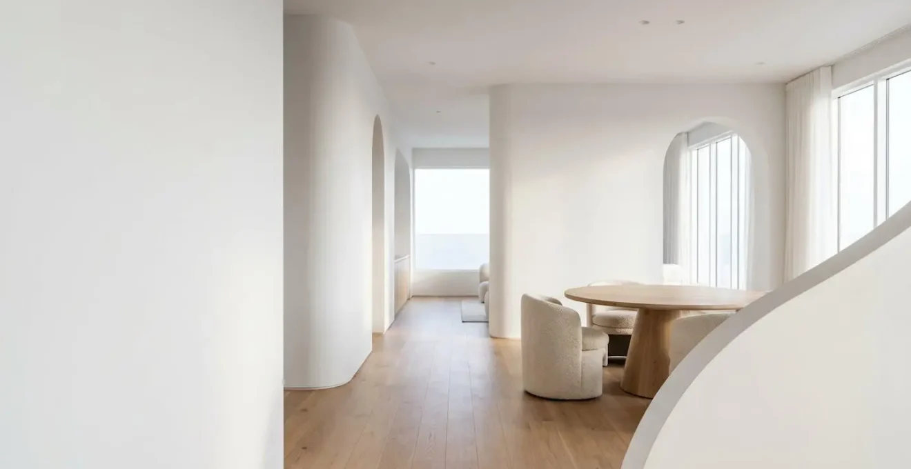
Round Tables vs Rectangular: Why Curves Improve Flow in Small Rooms?
After the walls, the next largest geometric statement in a room is often the dining table. In a compact or square room, a rectangular table is a tyrant. Its sharp corners jut out, creating awkward, pinched pathways and « dead zones » of unusable space. It dictates movement in a rigid, linear fashion. A round table, by contrast, is a democrat. It has no head, creating a more intimate and egalitarian dining experience, and more importantly, it liberates the space around it.
The magic of a round table lies in its impact on spatial flow. Because there are no corners to navigate, the circulation path around it is a smooth, continuous loop. This makes a small room feel significantly larger and less cluttered, as the physical and visual pathways are unobstructed. The negative space around a circle is active and fluid, whereas the negative space around a rectangle is static and confined. This principle is not just about a dining room; it applies to coffee tables, side tables, and ottomans.
As the visual above demonstrates, the clearance around a circular form is generous and efficient, promoting effortless movement. This is a core principle of fluid design: shaping objects to facilitate and celebrate movement, rather than impede it. As the design team at Oakavia notes, the choice is highly contextual:
Round tables suit compact or square rooms because they remove sharp corners and improve traffic flow, while rectangular tables make the most of longer, narrow rooms by using wall-to-wall space more efficiently.
– Oakavia Design Team, Oakavia Interior Design Guide
Choosing a round table in a boxy room is a strategic move to introduce a powerful point of fluidity that softens the entire geometry of the space.
The Return of the Arch: How to Replace Square Doorways for a Soft Look?
A standard doorway is a harsh cut in a wall—a hard-edged rectangle that serves a purely functional purpose. An arched doorway, however, is a piece of sculpture. It transforms a simple transition into an event. The re-emergence of the arch in contemporary design is often mistaken for a fleeting trend, but it is, in fact, a return to a timeless architectural form that understands human psychology. The curve of an arch is inherently more welcoming and gentle to the eye than the severity of a lintel and two posts.
As interior designer Jeneffer Jones Punjani highlights in an interview with Homes & Gardens, the effect is profound: « Arched doorways are becoming more popular as they can soften a space, creating an inviting transition between two spaces. » An arch doesn’t just open a path; it frames a view. It draws the eye upwards, adding a sense of height and grandeur to a space, and creates a graceful, almost narrative-like passage from one room to the next. This is a powerful tool for breaking up the monotony of a long, straight hallway or adding character to a standard new-build layout.
Retrofitting an arch into an existing square doorway is a surprisingly straightforward plasterboard project for a skilled tradesperson. It involves building out a curved frame within the existing opening and finishing it to create a seamless arch. It’s an intervention that offers a massive aesthetic return for a relatively contained structural investment.
Case Study: The Vertical Emphasis of Arches
The design studio Becki Owens has documented the powerful resurgence of arches in residential projects. In a recent analysis, the studio noted how arches are not just decorative but strategic. By their very shape, they create unexpected visual statements that draw the eye upward and emphasize wall height. An arched doorway naturally beckons you to enter a space while simultaneously making the room feel more spacious through this vertical emphasis. This marks a conscious shift away from decades of clean modern lines toward a richer architectural character.
By replacing a single square doorway, you introduce a soft, classical line that echoes through the entire home, undermining the tyranny of the right angle.
Fish Scale Tiles: How to Layout Non-Rectangular Tiles in a Bathroom?
Nowhere is the tyranny of the grid more apparent than in a tiled bathroom. The standard subway or square tile reinforces a rigid, predictable pattern. To introduce fluidity here, we must break the grid with non-rectangular shapes. The fish scale, or fan, tile is a perfect vehicle for this. Its form is a beautiful hybrid: a straight edge on one side and a perfect semi-circle on the other. When laid, these tiles create an interlocking pattern that is both geometric and deeply organic.
The pattern evokes the gentle, overlapping scales of a fish or the rhythmic unfurling of a bird’s feathers. This creates a dynamic rhythm that a simple grid cannot. The direction you lay the tiles dramatically changes the effect. Pointing upwards, they draw the eye up and feel uplifting. Pointing downwards, they create a cascading, waterfall-like effect. Laid sideways, they suggest movement along a wall. This directional versatility is a powerful design tool.
Laying out these tiles requires a different mindset. You are not just filling a space; you are creating a directional flow. The key is to start from a central line and work outwards, ensuring the pattern remains balanced. The partial tiles at edges and corners become part of the art, creating a beautiful tension between the organic pattern and the room’s straight boundaries. This connection to natural systems is no accident, as Earth Tatva Design explains:
Fish scale tiles align naturally with biophilic design philosophy because they do not imitate nature in an obvious way. Instead, they reflect natural systems through geometry and rhythm. The curves suggest flow. The repetition feels organic.
– Earth Tatva Design, Fish Scale Tiles: Bringing Flow Into Interior Spaces
By choosing a tile with an inherent curve, you infuse a utilitarian space like a bathroom with a layer of natural, flowing visual poetry.
Garden Paths: Why Meandering Paths Make Small Gardens Feel Bigger?
The principles of fluid geometry do not stop at your front door. The small, rectangular plot of a typical new-build garden often feels constrained and uninspired. The most common mistake is a straight path from the door to the back fence. This acts like an arrow, drawing the eye directly to the boundary and emphasizing the garden’s small size. It is a journey of a few seconds with no mystery and no delight.
A meandering, curved path does the opposite. It is a master of illusion. By gently winding through the space, it forces the eye—and the feet—to slow down. The journey is elongated, making the garden feel substantially larger than it is. Each curve presents a new, slightly different view and, more importantly, can be used to partially obscure what lies ahead. This creates a sense of discovery and intrigue. You are invited to wonder what’s around the next bend, even in a small space.
The key to a successful meandering path is to make the curves feel intentional, not arbitrary. They should navigate around a strategic planting bed, a specimen tree, or a small seating area. The path’s curves and the shapes of the garden beds should work in concert, creating interlocking forms like a simplified yin-yang. This interplay of positive (path) and negative (planting) space is where the magic lies. Use materials that feel natural, like irregular flagstones or gravel, to further enhance the organic feel and soften the edges.
By abandoning the straight line, you transform a simple backyard into a small, explorable landscape, a space of slow discovery rather than a quick glance.
Battersea Power Station: How to Convert an Industrial Giant into Luxury Flats?
If a new-build home is a small box, an industrial cathedral like Battersea Power Station is a box of monumental, intimidating scale. Its conversion into a luxury residential and commercial hub is perhaps the ultimate case study in softening rigid, powerful geometry. The original structure is an icon of muscular, brick-clad Art Deco design—symmetrical, powerful, and overwhelmingly angular. The challenge was how to insert a human, domestic scale into this industrial giant without erasing its historic character.
The solution was a masterful dialogue between the old and the new, the straight and the curved. Instead of mimicking the original style, the new architectural interventions often employ fluid geometry as a deliberate contrast. Frank Gehry’s Prospect Place, part of the development, is a prime example. Its rippling, sculptural facades of white metal and glass stand in soft, flowing opposition to the rigid, red-brick mass of the power station itself. These are not arbitrary curves; they are designed to maximize light and views, creating unique, non-uniform apartment layouts that defy the typical « box » format.
Inside the power station’s restored turbine halls, new mezzanines and structures often feature curved edges and rounded forms. These soft insertions break up the cavernous scale of the original halls, creating more intimate zones for retail and recreation. The contrast between the weathered industrial tectonics and the smooth, flowing lines of the new elements is a source of immense architectural drama. The curve does not fight the grid; it dances with it.
Battersea teaches us that fluid geometry can be the key to humanizing even the most imposing of structures, creating softness and life in dialogue with history.
Fractals in Design: Why Does Looking at Leaf Patterns Reduce Stress?
Why do we find a curved wall, a fan-shaped tile, or a winding path so pleasing? The answer lies deep within our evolutionary programming, in a concept from mathematics and nature known as fractals. A fractal is a pattern that repeats itself at different scales. Think of the branching of a tree: a large trunk splits into smaller branches, which split into even smaller twigs. A fern frond is composed of smaller fronds, which are themselves composed of even smaller fronds. This « self-similarity » is the visual language of the natural world.
Our brains are hardwired to recognize and process these patterns with ease. The theory of biophilia suggests that humans have an innate affinity for nature. When we are in environments that reflect the patterns of the natural world, our stress levels decrease. Our minds find a sense of effortless order and calm in the complexity of a fractal pattern. This is known as « biophilic design »—the practice of connecting architecture and design with nature to improve our well-being.
Rigid, Euclidean geometry—the world of perfect squares, circles, and straight lines—is largely a human invention and is rare in nature. An environment dominated by these simple, non-fractal shapes can feel sterile and neurologically draining. Looking at a leaf pattern, a coastline from above, or the veining in a piece of marble is a form of passive mental restoration. The fluid geometries we have been discussing—arches, organic curves, meandering lines—are, in essence, simplified applications of these natural, fractal principles. They are a way of reintroducing the soothing, ordered complexity of nature back into our man-made boxes.
By integrating these patterns, you are not just making your home look « natural »; you are creating an environment that is scientifically proven to be more restorative and calming.
Key Takeaways
- Fluidity Over Decoration: The most profound changes come from altering the architectural ‘bones’ (walls, doorways) rather than just adding curved decor.
- Spatial Flow is Key: Use curved forms, like round tables, to improve circulation and make small, boxy rooms feel larger and more dynamic.
- Biophilia is the ‘Why’: Our innate positive response to curves and organic patterns is rooted in our connection to nature’s fractal geometry, which reduces stress.
How to Integrate Biophilic Design Principles into a UK Urban Home?
We have journeyed from the structural wall to the psychology of patterns. The unifying thread is biophilic design: the idea that integrating nature and natural patterns into our built environment is essential for human health and happiness. For the UK homeowner in a modern urban development, this is not about creating a literal jungle indoors. It is about a subtle, strategic integration of natural analogues, forms, and light that honors our innate need for connection to the living world.
Fluid geometry is a primary tool of biophilic design. It is the practice of using « natural analogues »—forms and patterns that mimic those found in nature—to shape our spaces. The arch of a doorway mimics the gentle curve of a sheltered cave opening. The pattern of fish scale tiles reflects the rhythm of water and life. The biomorphic shape of a sofa or chair, with its soft, flowing lines, feels more like a form to be embraced than an object to sit upon. It’s about creating an environment that feels less manufactured and more evolved.
Bringing these principles into your home is a matter of observation and intention. It’s about favouring materials with natural texture and variation, like wood grain or stone veining. It’s about maximizing natural light and creating diffused, dappled light that mimics a forest canopy. And, most importantly, it’s about breaking the tyranny of the straight line and the perfect grid wherever you can, replacing it with the gentle, restorative power of the curve.
Your Action Plan: Audit Your Home for Fluidity
- Points of Contact: List every hard-angled corner, square doorway, and rigid piece of furniture that defines your space’s « boxiness. »
- Collect Inspiration: Inventory existing elements with curves you love (a vase, a pattern on a cushion) and gather images of natural fractal patterns (leaves, shells, water ripples).
- Check for Coherence: Confront your list of « hard angles » with your inspiration. Where could an arch replace a doorway? Where could a round table replace a square one? Does the change align with your goal of a softer, more flowing home?
- Assess Emotional Impact: For each potential change, ask: does this feel more « restorative » or just « decorative »? A true biophilic intervention should evoke a sense of calm and natural order.
- Create an Integration Plan: Prioritize the changes. Start with the most impactful yet achievable intervention, whether it’s replacing a coffee table or commissioning an arched doorway, and build from there.
Start today. Choose one right angle in your home and dare to imagine it as a curve. That is the first step in un-making the box and creating a truly living space.