The secret to a minimalist family home isn’t getting rid of all your kids’ stuff; it’s strategically containing chaos to protect and amplify tranquility.
- Minimalism in a family setting is an achievable system of organization, not an impossible aesthetic of deprivation.
- Reducing « visual noise » through hidden storage, textured monochromatic palettes, and intentional lighting has a greater impact than simply owning fewer things.
Recommendation: Stop fighting a losing battle against clutter everywhere and start architecting your home with designated « Sanctuary Zones » and « Activity Zones » to find peace in reality.
The dream is a serene, minimalist home—a sanctuary of calm with clean surfaces and a place for everything. The reality for most parents is a landscape of scattered toys, burgeoning laundry piles, and kitchen counters that serve as a final resting place for mail, school art, and half-eaten snacks. It feels like an impossible gap to bridge. You see the polished photos in design magazines and assume that minimalism and family life are mutually exclusive.
The common advice to « just declutter » or « buy less » is frustratingly simplistic. It ignores the vibrant, messy, and beautiful reality of life with children. It positions every toy, every drawing, every beloved mismatched object as an enemy of peace. This all-or-nothing approach leads to burnout and a feeling of failure, reinforcing the belief that visual tranquility is a luxury you can’t afford.
But what if the fundamental premise is wrong? What if true minimalism in a family home isn’t about achieving a state of empty perfection, but about mastering the art of strategic containment? This guide reframes the goal: we will not eliminate chaos, but architect around it. We will explore a practical system for reducing visual noise, creating intentional focal points, and designing an environment that supports well-being, proving that a calm, aesthetically pleasing home is possible, even when it’s full of life.
This article will guide you through a systematic approach to transforming your home. We’ll start by managing what you already have with intelligent storage and design, then build habits to maintain clarity, and finally, architect a home environment that fosters well-being for the whole family.
Summary: Your Guide to a Serene Family Space
- Hidden Storage: How to Design Cabinets That Disappear into Walls?
- Monochromatic Schemes: How to Layer Textures Instead of Colors?
- The « One Touch » Rule: How to Keep Kitchen Counters Clear Permanently?
- Statement Pieces: Why One Great Sofa Is Better Than 3 Average Chairs?
- Architectural Lighting: How to Light a Room Without Seeing the Fixtures?
- The Hanger Trick: How to Identify Clothes You Never Wear in 6 Months?
- Standing Desks: Do They Really Fix Back Pain or Create New Problems?
- How to Architect Your Home Environment for Maximum Well-being and Ergonomics?
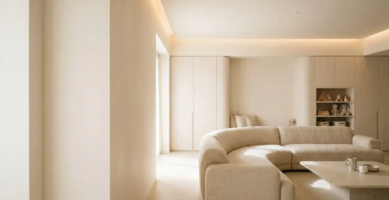
Hidden Storage: How to Design Cabinets That Disappear into Walls?
The first principle in reclaiming your home from visual chaos is subtraction through concealment. Before you can appreciate clean lines and calm spaces, you must first manage the sheer volume of « stuff » that defines family life. The most effective strategy is not to discard everything, but to design storage that doesn’t add to the visual clutter. The goal is to make cabinets and cupboards feel like part of the wall, an architectural feature rather than a piece of furniture.
This is achieved through techniques that trick the eye. Using flush-mounted doors with no visible frame creates a seamless plane. Painting these surfaces in the exact same color and finish as the adjoining walls makes them recede visually. The final, crucial step is installing push-to-open mechanisms, which eliminate handles—the small, repetitive details that create a surprising amount of visual noise. The result is a wall that discreetly holds everything from appliances and coffee bars to the daily influx of backpacks and shoes in a designated « family drop zone » near the entrance.
This approach transforms storage from a purely functional necessity into a sophisticated design element. As designers are proving with furniture-style hidden cabinets, when the doors are closed, the room maintains a refined, uncluttered atmosphere. When opened, they reveal highly organized, accessible centers for daily life. It’s the ultimate expression of having your cake and eating it too: everyday items are instantly accessible but remain completely invisible, effectively containing clutter at its source.
By making storage a non-feature, you create a calm backdrop, allowing the rest of your minimalist efforts to shine.
Monochromatic Schemes: How to Layer Textures Instead of Colors?
Once you’ve cleared away the visual noise of clutter, the next layer to address is color. A common misconception about minimalism is that it requires a sterile, all-white environment. In a family home, this can feel cold and impractical. The true minimalist secret to creating a calm, sophisticated space is to reduce the color palette but dramatically increase the textural variety. A monochromatic scheme—using various tints, tones, and shades of a single hue—provides a serene foundation.
Texture creates shadow and light play, which adds depth even when the color difference is minimal.
– Coastal Cottage of Amelia Interior Designers, Monochromatic Interior Designs for Depth Without Flat Spaces
This is the key to avoiding a flat, boring look. For a busy parent, the textures chosen must also be highly functional. Think about combining a smooth, wipeable vinyl or leather on a dining bench, the visible loops of a machine-washable boucle on accent pillows, and the tight weave of a stain-resistant rug. Each element is in the same color family—perhaps a warm taupe or a soft grey—but the tactile difference between them creates visual interest and a sense of coziness and depth.
As you can see in the interplay of materials, the light catches each surface differently. The smooth surface reflects light, the woven surface absorbs it, and the rough surface creates micro-shadows. This dynamic play prevents the space from feeling one-note. It’s an approach that delivers maximum visual calm with maximum sensory richness, making the space feel both peaceful and inviting—a perfect combination for a family sanctuary.
This strategy allows you to build a sophisticated and forgiving backdrop for family life that feels intentional, not empty.
The « One Touch » Rule: How to Keep Kitchen Counters Clear Permanently?
With storage and surfaces addressed, we move to the most challenging frontier: daily habits. The kitchen counter is the epicenter of family clutter. It’s a magnetic surface for anything that doesn’t have a designated home. The « One Touch » Rule is a simple but powerful system to combat this. The rule is: when you bring an item in, you touch it only once before it reaches its final destination. Mail isn’t put on the counter « for later »—it’s opened and filed or discarded immediately. Groceries are not placed on the counter to be put away « in a minute »—they go straight into the pantry or fridge.
This may sound extreme, but the psychological cost of cluttered counters is very real. In fact, research reveals that 58% of people say messy counters stress them out daily. This isn’t just an aesthetic preference; it’s a matter of mental well-being. A cluttered environment bombards our brains with excessive stimuli, making it difficult to relax and focus. This is scientifically validated; a landmark Princeton University study on clutter discovered that clutter can make it hard to concentrate on a singular task.
In the kitchen, this means your brain is fighting against visual noise while you’re trying to cook, making the process more stressful and less efficient. Implementing the « One Touch » rule requires setting up your kitchen for success. This means having a clear, designated station for every task (coffee making, snack prep, mail processing) and ensuring every single item has a logical, easy-to-access home. By making the ‘correct’ action the path of least resistance, the « One Touch » rule stops being a chore and becomes a background habit that permanently preserves the most valuable real estate in your home: a clear, calm counter.
It’s a behavioral shift that turns a chaotic surface into a functional, serene workspace, day after day.
Statement Pieces: Why One Great Sofa Is Better Than 3 Average Chairs?
The minimalist philosophy is often summarized as « less is more, » but a more accurate version for a family home would be « fewer, but better. » Once you’ve cleared the clutter, you create the space to be intentional about what you bring in. This is where the power of the statement piece comes into play. Instead of filling a room with several mediocre, trend-driven items, you invest in one or two pieces of exceptional quality, design, and comfort. A single, beautifully crafted sofa has more visual impact and provides more long-term value than a trio of cheaper chairs that will need replacing in a few years.
This isn’t about extravagance; it’s about smart, long-term economics. For families, furniture is an investment, and it’s essential to think in terms of « cost-per-use » or « cost-per-sit. » While a high-quality piece has a higher upfront cost, its durability dramatically lowers its cost over time. According to industry analysis, high-quality furniture lasts 10-20+ years, compared to 3-5 years for cheap alternatives. A comprehensive analysis of a leather sofa, for example, shows that a piece costing twice as much but lasting three times longer results in a significantly lower total cost of ownership.
Beyond the financial logic, this approach has a profound effect on the room’s aesthetic. A statement piece acts as a visual anchor. It gives the eye a beautiful, intentional place to rest, drawing attention away from the inevitable scuffs and stray toys of family life. It elevates the entire space, making it feel curated and purposeful rather than randomly assembled. Choosing one great sofa isn’t just a seating decision; it’s a strategic move to create a focal point of quality and comfort that defines the character of your family’s main living area for a decade or more.
This shift in perspective is fundamental to building a home that is both beautiful and resilient.
Architectural Lighting: How to Light a Room Without Seeing the Fixtures?
Lighting is one of the most powerful and overlooked tools in creating a minimalist aesthetic. The goal is to light the room, not to showcase the light fixtures. Architectural lighting integrates light sources directly into the home’s structure, creating a warm, inviting glow without adding to the visual clutter. This technique is about experiencing the effect of light—the ambiance, the mood, the focus—without being distracted by the source.
This is achieved through a layered lighting plan that combines three types of invisible light:
- Ambient Light: This is the general, overall illumination of the room. It can be created by hiding LED strips in ceiling coves to wash the ceiling with a soft, indirect glow, or along baseboards to make the room feel like it’s floating. This makes a space feel larger and airier.
- Task Light: This is focused, functional light for specific activities. It can be achieved with discreet, recessed spotlights aimed at kitchen prep zones, a reading nook, or a homework station. It provides « focus mode » lighting without a visible lamp.
- Accent Light: This is directional light used to create focal points, such as highlighting a piece of art or grazing a textured wall to cast dramatic shadows. It guides the eye intentionally, adding depth and drama.
The key to success is using a warm white light (around 2700K temperature) to create a cozy, inviting atmosphere rather than a cold, clinical one. Installing dimmer switches or a smart control system is also critical, as it allows your family to tailor the room’s mood from « bright homework focus » to « calm evening wind-down. » By making the light fixtures disappear, you put the focus back on the space itself and the life lived within it.
It is the ultimate step in creating a home that feels both professionally designed and deeply personal.
The Hanger Trick: How to Identify Clothes You Never Wear in 6 Months?
The wardrobe is a primary zone of clutter, a place where good intentions and past versions of ourselves go to accumulate dust. We hold onto items « just in case, » for when we lose weight, or because we feel guilty about the money spent. The « Hanger Trick » is a ruthlessly effective, data-driven method to cut through this emotional fog and identify what you actually wear.
The system is brilliantly simple. At the start of a season (e.g., fall), you do two things. First, turn all the hangers in your closet so the hook faces the wrong way—out towards you. Second, attach a small, colored ribbon or zip tie to the neck of every hanger. As you wear, wash, and return an item to the closet, you do two things: you hang it back up with the hanger facing the correct way, and you move the ribbon to the opposite side of the hanger hook.
Six months later, at the end of the season, you have an undeniable visual record of your habits. Any hanger still facing the wrong way holds an item you haven’t touched in half a year. Any hanger with the ribbon in its original position tells the same story. There is no room for debate or « but what if » scenarios. The data is clear. This allows you to make unemotional decisions about what to donate, sell, or discard. For items on the fence, you can even calculate their « cost-per-wear » by dividing the original price by the number of times worn to assess their true value. Gamifying this by giving each family member their own color of ribbon can even turn a tedious chore into a family activity.
It’s a practical, systematic approach that replaces emotional attachment with cold, hard facts, making decluttering the wardrobe faster and far more effective.
Standing Desks: Do They Really Fix Back Pain or Create New Problems?
As our homes increasingly double as our offices, the conversation around minimalism must expand beyond aesthetics to include ergonomics and physical well-being. The standing desk is often touted as a cure-all for the sedentary lifestyle, but for a family, its introduction can be complicated. Does it really fix back pain, or does it just trade one static, uncomfortable posture for another, while also introducing a new piece of bulky furniture?
The key insight from ergonomic experts is that the goal isn’t to stand all day. The real benefit comes from movement and variation.
The goal is not to replace one static posture with another, but to facilitate easy transitions between sitting, perching, and standing throughout the day.
– Ergonomic Design Experts, Movement Spectrum Approach to Standing Desk Usage
For a minimalist family home, the right standing desk is one that supports this « movement spectrum » while minimizing its physical and visual footprint. When selecting one, several family-specific factors are critical. First is stability at full height; it must be solid enough that it won’t tip if a child leans on it. Second is integrated cable management to eliminate trip hazards. Third is a durable, forgiving surface that can withstand being used for homework and art projects. Finally, a smooth, quiet adjustment mechanism allows for seamless transitions without disrupting the household.
When chosen correctly, an adjustable desk doesn’t add clutter; it consolidates it. It can replace a separate desk and an ergonomic chair with a single, flexible workstation that can be adapted for multiple users and tasks. It embodies the minimalist principle of investing in a single, high-functioning piece that serves multiple needs, promoting both a clean aesthetic and the physical health of the entire family.
The focus shifts from simply owning a standing desk to creating an environment that encourages dynamic movement throughout the day.
Key Takeaways
- Minimalism in a family home is not about deprivation, but about the strategic containment of chaos to protect calm.
- Reducing « visual noise » through integrated storage, textured monochromatic palettes, and invisible lighting is more impactful than simply owning less.
- The most effective minimalist homes are built on systems and habits (like the « One Touch » rule) that make order the path of least resistance.
How to Architect Your Home Environment for Maximum Well-being and Ergonomics?
We’ve explored tactics for storage, color, habits, and furniture. Now we arrive at the central philosophy that ties it all together: architecting your home as an environment for well-being. This is not about interior design in the traditional sense. It’s about consciously structuring your space to reduce stress and support your family’s mental and physical health. The impact of our home environment is profound; an Indiana University study found that the way people describe their homes could reflect whether time there feels restorative or stressful.
The key to making a home feel restorative, even with the energetic chaos of children, is a zoning strategy. This is the practical application of the « Sanctuary and Sacrifice » method. You intentionally design and fiercely protect « Sanctuary Zones »—these are the calm, minimalist areas like your bedroom, a reading corner, or the main living area. In these zones, the rules of minimalism are strictly enforced: clear surfaces, calming palettes, and minimal objects.
Simultaneously, you designate and equip « Activity Zones » (or « Chaos Zones »). This could be a corner of the living room with well-designed toy storage, a durable art table, or a playroom. Within these boundaries, creativity and mess are not only allowed but encouraged. By containing the chaos, you prevent it from overwhelming the entire home. This intentional zoning makes the psychological benefits of a minimalist approach achievable because it acknowledges and provides for the reality of family life, rather than fighting against it.
Your 5-Step Plan to Audit Your Home’s Well-being
- Visual Noise Audit: List every horizontal surface that consistently collects clutter (e.g., kitchen counter, entryway table, top of the dresser). These are your starting points.
- Usage Inventory: Apply the « Hanger Trick » logic to one category beyond clothes (e.g., mugs, toys, books). Use stickers to mark items used over one month to get a real-world inventory of what’s essential.
- Zoning Blueprint: Draw a simple floor plan of your home. Color-code the « Sanctuary Zones » you want to protect (e.g., green for calm) and the « Activity Zones » where life happens (e.g., yellow for energy).
- Statement Piece Identification: Walk through each room and identify the one item that brings you the most joy or has the most sentimental value. Then, identify three « filler » items you could live without.
- System Integration Plan: Choose one point of friction from your Visual Noise Audit (e.g., mail on the counter) and design a complete « One Touch » system for it (e.g., a small station with a letter opener, recycling bin, and file).
By architecting your home with this balance of sanctuary and activity, you are not just creating a house that looks good; you are building a resilient, supportive environment that enhances your family’s overall well-being.